Website design can be challenging. There are always so many new design possibilities and it can be difficult to decide what is necessary and what to leave out.
What attracts more readers? Why are people not staying to read more? These questions might be answered through the mistakes many people make when designing their websites. Look at some of the most common problems with websites and make sure to avoid them at all costs.
1. Can’t Read This. So many fonts, so many colors, it can all be overwhelming. Sometimes you just want to try it all. But there are reasons many sites use similar color schemes and font styles. Some types are just easier to read. It can be exciting to see all of the options but keep in mind who all of the design is for. You don’t want to scare away readers just because they can’t actually read what you have written.
Also keep in mind that you have to stay organized. It can be difficult to read through a page if you have a lot going on. Readability is a huge priority.
Tip: Take a look at how other companies have designed their pages. What do you like about their fonts and color choices? What do you think could work better? Doing a little bit of research can go a long way.
2. Only Writing. We don’t really read thoroughly anymore. People looking at websites these days skim. We like to get the gist of the page without actually having to spend time figuring out what it says. If a page just has writing with little to no breaks in the page we aren’t going to look at it very long.
Tip: Keep in mind that we need guidance. Headings, sub-headings, and bolded fonts show readers what parts are the most important. Bullets, keywords, anything that can stand out against the rest of the writing, will all make readers much happier to look at your website.
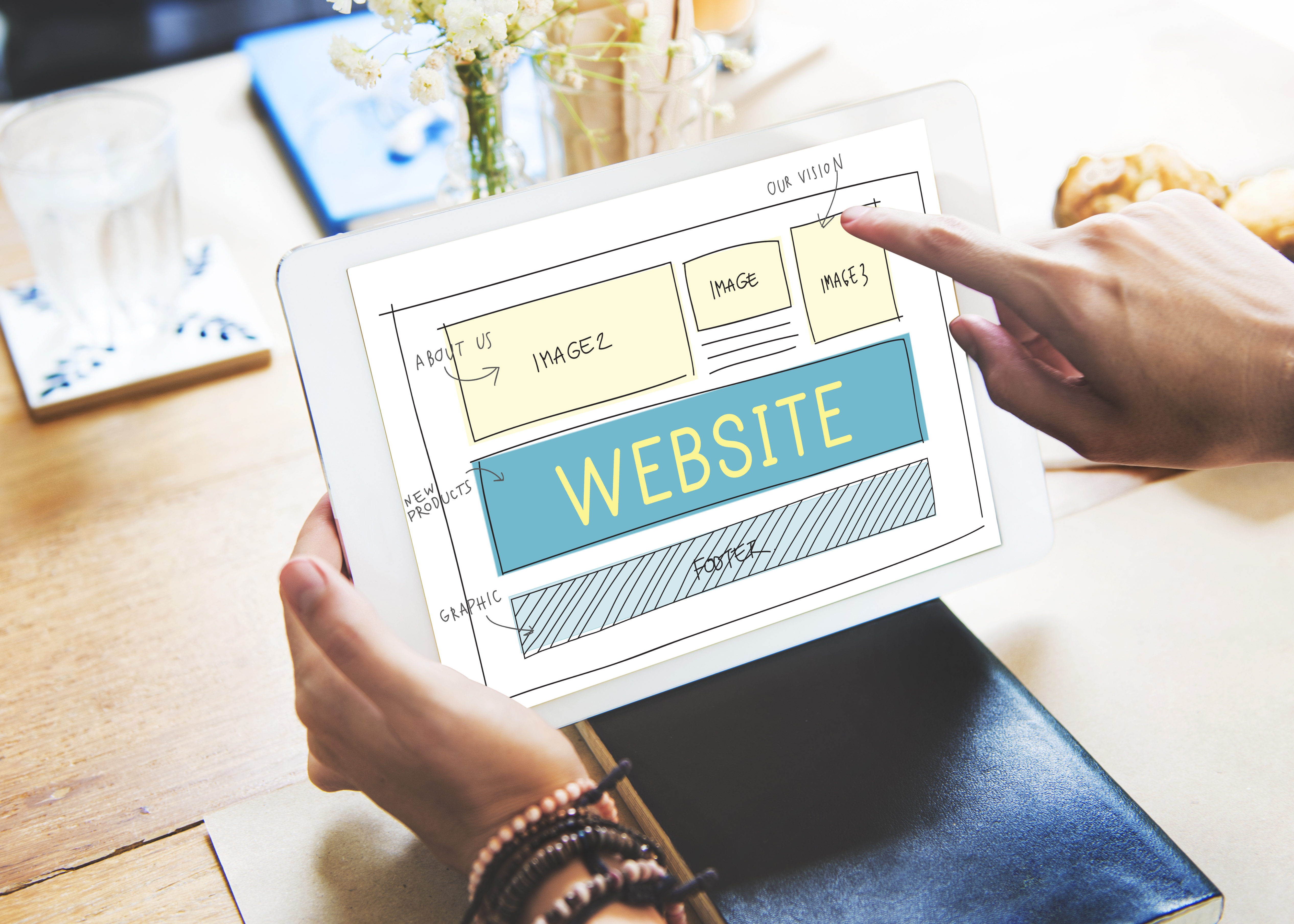
3. Images Everywhere (Or No Where to Be Found). We say it all the time: visuals are very important. They catch the eye; they keep people interested; they can be a fun way to gain all of the attention you want. But if you fill every page with images then your content can get lost. Images are distracting. Adding a couple can spice up a page, but keep in mind that there is such a thing as too many. They should be used to guide your reader through your content, not to draw away from it.
Tip: Whitespace is your best friend! It is very necessary for your website design success. Clutter is stressful. That whitespace makes your page clear, organized and over all amazing. But do use a couple of images here and there to make everything a bit more interesting. We aren’t taking away all creativity here.
 (
(4. Navigation Problems. Keep your layout organized and straightforward. Your navigation is the only way for readers to successfully move through your website and find what they’re looking for. If you put it in different places, or don’t use good descriptions, people won’t be able to use your website and will stop visiting. Intuitive design. People don’t want to have to think how to click to another page. It should be obvious.
Tip: Place the navigation in an easy to access location, and keep it the same on every page. Make any words used concise and as clear as possible. Keep it accessible.
5. Inconsistency. When designing a website it can be fun to use everything. Finally! Creativity! Why not make each page different and change elements? Well, because that’s confusing and strange. It can be hard to stop yourself from going overboard, we know. But keep it simple. If you get a little excessive with your creativity you can confuse readers. Really, this makes your life easier!
Tip: Use the same template for your entire website. No matter what page your reader is on, it should look consistent with your design theme. You don’t want people to get confused. Keep your elements similar across all pages and readers should be glad to stay on your website.